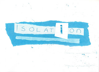
I started the taster with an idea of what the graphics discipline was about it was interesting to explore some of the skills involved. Despite being absent for the majority of the graphics taster, I managed to develop four outcomes. These are not as strong overall as they could have been because of their rushed development.
My first word was 'isolation'. I chose to base my idea around the letter 'i' because it can stand for the individual. I gave it space around it and made it different from the surrounding letters, I also gave it its own background. I kept the colour palette blue and white to give the image a clinical feel. I made the 'i' out of eyes to add humanity. The final piece was OK but could have been stronger with more time and digital development.
Next I did 'fuse', my idea was to merge all the component letters together into one form. I tried two different fonts before creating my image using different colours and scales. I used bright blue and yellow to introduce an electrical theme. I thought the final image was quite effective but the layout detracted from the word too much.
I created 'balance' quickly and spontaneously. My first idea involved balancing the spacing of the letters in the word around the central point. I used collaged circles to strengthen this idea and to represent planets and the balance of the universe. Although the simplicity of my design is effective I again would like to develop this digitally, if for no other reason but to explore the possibilities.
This piece was created when I was very short on time. I am not happy with the outcome. the idea wasn't that strong to start off with and I executed it poorly. If I have time I am especially keen to revisit this.
Overall I am somewhat satisfied with this work however I will revisit it before its assesed if I get time.


No comments:
Post a Comment