
Tuesday, 16 October 2012
David Mellor Cutlery Design

Eileen Gray 3D Design

Thursday, 11 October 2012
Fashion
After seriously distorting some basic bodice blocks to create wacky shapes out of paper, the task was to cut, manipulate and ultimately make my wacky shape fit a mannequin, and here are my results! With hindsight a little more simple and elegant could have been good but there's some nice contrasts between the fluid flowing shapes and the boxy cuts into some of the pieces.
My piece has the combination of structure and fluidity that I associate with the internal workings of shells. The paper lends to its bone like quality. For some reason (probably the swirls and the shape over the shoulders at the back) it also makes me think of ancient Greek architecture and imagery.
As an exercise in design development there are certainly shapes and lines that I can bring out onto other pieces and it strikes me as a highly fast and effective way of generating ideas.


I went on to digitally develop my design by taking elements and positioning them on the figure.

A bit sketchy for an illustration but great for developing my garment.
Surface Pattern
I worked on these observational drawings as a starting point to my pattern.
Using different grounds definitely improved the final image quality. The most effective method of working I found was to work mainly with ink, I accentuated lines with a graphite stick and worked into negative spaces with emulsion and masking tape. I think the limited use of masking tape on the left drawing was effective at improving the outline of the shape.


These are the second set of observational drawings I created. This time I put a lot more thought into colour and technique and I believe the outcomes are much stronger. Layering different sized images created attractive negative spaces that I could take into my work.


I took shapes and lines from these drawings and created mono prints which aren't visually to my taste. Although there are patterns and textures that could be incorporated into future work.


Taking inspiration from my previous studies I created these two final panels. They both share colours and techniques that help them to look cohesive as a pair of panels. the wool stitching running through both designs helps bring them together while the collaged grounds improves the texture.

The final stage was to create fabric samples developed from my panel. So far I have only managed to develop one but I will update with more soon.


Using different grounds definitely improved the final image quality. The most effective method of working I found was to work mainly with ink, I accentuated lines with a graphite stick and worked into negative spaces with emulsion and masking tape. I think the limited use of masking tape on the left drawing was effective at improving the outline of the shape.


These are the second set of observational drawings I created. This time I put a lot more thought into colour and technique and I believe the outcomes are much stronger. Layering different sized images created attractive negative spaces that I could take into my work.


I took shapes and lines from these drawings and created mono prints which aren't visually to my taste. Although there are patterns and textures that could be incorporated into future work.


Taking inspiration from my previous studies I created these two final panels. They both share colours and techniques that help them to look cohesive as a pair of panels. the wool stitching running through both designs helps bring them together while the collaged grounds improves the texture.

The final stage was to create fabric samples developed from my panel. So far I have only managed to develop one but I will update with more soon.

Rodarte


Saturday, 29 September 2012
Lee Fredlander

Hiroshi Sugomoto - Bass Strait, Table Cape

Friday, 28 September 2012
Tony Ray Jones

The juxtaposition of the cartoon fantasy image in the background and the real life couple beneath makes this image. The contrast is as obvious as possible with the cartoon in each others arms and the real couple facing away from each other with unenthusiastic expressions on both their faces. The sign behind appears to represent the long forgotten hoped and dreams of two people just getting on with life.
Composition in the style of Torsten Brinkman

Light Pictures - Long exposure Photography
This started as a group activity using different coloured torches over a long exposure time to draw around the siluette of the subjects.


Here I tried drawing a spiral around two separate poses . I think the overlapped images gives the picture depth .The long spiralling lines are smooth and soft. Although I hoped the two figures would appear silhouetted together, I like the depth and separation o the two figures.

This was 'drawn' using a torch while facing a posing model. Even though the final image is very abstracted it is surprisingly realistic in the sense that I can still make out arms legs a head and even the pose.


Here I tried drawing a spiral around two separate poses . I think the overlapped images gives the picture depth .The long spiralling lines are smooth and soft. Although I hoped the two figures would appear silhouetted together, I like the depth and separation o the two figures.

This was 'drawn' using a torch while facing a posing model. Even though the final image is very abstracted it is surprisingly realistic in the sense that I can still make out arms legs a head and even the pose.

Thursday, 27 September 2012
Imogen Cunningham - Arujia Seed Pod

The composition of this photograph strikes a pleasing balance between the solidity of the seed pod and the softness and transparency of the seeds spilling out. The shapes in this work bears a resemblance to the work of Georgia O'Keeffe (Black Iris 1926), and are abstractly anatomical which strengthens the themes of new life and 'mother nature'.
Idris Khan - A Memory of Kate

The fluidity of the edges also highlights an acute awareness of time and movement which could represent the precious fragility of human relationships. The photographs are layered so that key features, especially the eyes, are in the right place so the photo is not completely abstracted which helps the viewer connect on a human level with the subject.
Paulo Roversi - Simon

Simon Norfolk - Abandoned mortar shells in a date grove

The deep shadows lend drama to an already poignant image of a large quantity of weaponry in a war zone. The lit area in the middle of the image, surrounded by darkness, acts like a spotlight making this an excellent documentary photograph "shining a light" on the issues involved.
Sandy Skoglund

Sarah Moon - Adriana pour Watanabe 1998

I like this photo because its soft style and lighting reflects the soft pleated garment it depicts. the blurred edges and unnatural skin tone gives the image a surreal look that mimics that of a painting. I also like the strong relationship between the figure and the background, I think it captures the effect of the dress as a whole as opposed to specific details much like an illustration.
Photography - Chesterfield town centre
Photographs taken in Chesterfield town centre during my photography taster.
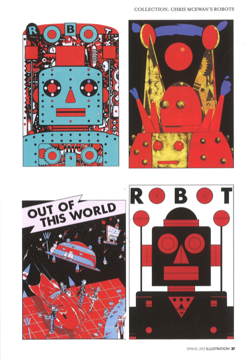
Chris McEwan's Robots - Illustration Magazine
This article is interesting because it shows how different but similar influences have inspired this illustrators work over a large period of time. There is lots of variation in the style he has developed even though the subject is similar.


Wednesday, 26 September 2012
Illustration Theory

Everyman - Ronald Searle, Lithograph
This image combines an intricate drawing style with quite a simple composition to produce a focused image. The eye is immediately drawn to the figure despite the fact it is quite small. the pallet of muted shades and grey makes the image seem dark sinister.
Graphics Theory - Article


Subscribe to:
Posts (Atom)