Hi!
This is an old blog from college. I'm keeping it up and running for the time being because its got some work from my art foundation that I'm pretty keen on.
There are also a few great artists I came across so feel free to have a gander but bear in mind I have progressed into my degree and my standard of work has (I hope!!) moved on from this.
I'm in the process of creating a stronger and more representative online presence for myself so I'll be posting links to more recent stuff if you want to check out what I'm up to nowadays.
Much Love!
Lola xx
Thursday 19 February 2015
Sunday 16 June 2013
Whats around the corner?

Heres a little peak of what I've been up to.
Monday 11 March 2013
Messing with Sketchbook Pro
I've been playing with Sketchbook Pro on a tablet and here are some of the things I’ve come up with. I haven’t got a stylus yet so I've been using my finger with mixed results. It’s nice to be able to create a digital image that still has that human- error-hand-drawn feel.
.jpg)
This image is drawn from a magazine photograph as opposed to from life. I tried using a paintbrush with low opacity to create something resembling an actual painting. I got a lot of detail in the face. I guess the lower portion of the picture could have done with more work. I found creating the skin tones much easier than in real life. Although the image does share some qualities with a painting, its luminosity gives it away I think.
Earlier I did a lot more experiments quick sketches using layers and different brushes. It’s nice to be able to just mess about with drawing without committing to putting pen to paper but the undo and rubber tools are very tempting.
 On this one the proportions aren't quite right but I like the energy. The
strokes were quick and expressive and I just sort of scribbled it. The subject
was moving so the image changed during its creation which I thought gave it a
bit more life and movement.
On this one the proportions aren't quite right but I like the energy. The
strokes were quick and expressive and I just sort of scribbled it. The subject
was moving so the image changed during its creation which I thought gave it a
bit more life and movement. This one I created a fairly detailed single line drawing to which I added colour
on a layer beneath it. I used different kinds of brushes to try to effectively
represent different surfaces. I'm fairly pleased with the outcome but the image
could have more shading to show more depth. It just looks slightly two dimensional.
This one I created a fairly detailed single line drawing to which I added colour
on a layer beneath it. I used different kinds of brushes to try to effectively
represent different surfaces. I'm fairly pleased with the outcome but the image
could have more shading to show more depth. It just looks slightly two dimensional.Wednesday 20 February 2013
Zoe Jordan - London Fashion Week
Whole show can be found
http://youtu.be/M4-UwFYomWM
There's just something really sophisticated about these clothes. mixing subtle and more dramatic prints alongside mixed fabrics and flashes of bright orange make for a brilliant, elegant collection.


http://youtu.be/M4-UwFYomWM
There's just something really sophisticated about these clothes. mixing subtle and more dramatic prints alongside mixed fabrics and flashes of bright orange make for a brilliant, elegant collection.


Wednesday 6 February 2013
Nose to the grindstone...
I've gone a bit quiet recently due to a high volume of work to do with
my university application. The majority of this is now done, so from now I will
be trying to keep this page updated weekly.
So here's what I've been up to!
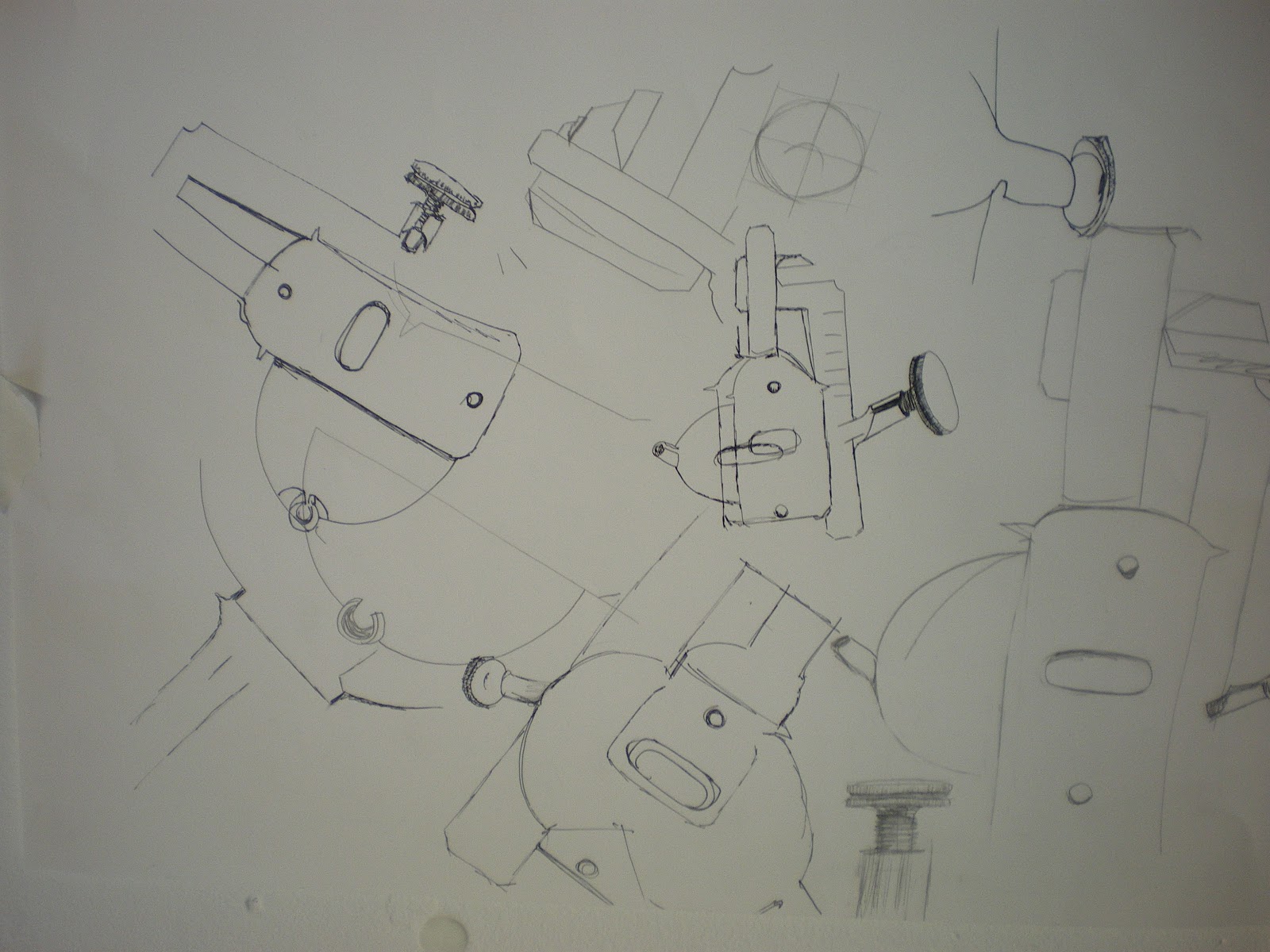
The Tube Works
This was a project focused predominantly on research and development as
opposed to outcomes. Although there were other areas of investigation and
sampling which I haven't included here, this was the main focus.
I started with a tubular object which I drew lots of times in ways that
moved from purely representational to abstract. Within my drawings I found new
shapes which I exaggerated and developed.

Wednesday 9 January 2013
Caitlin Charles-Jones
Absolutely stunning conbination of print, materials and cut from this graduate collection from Caitlin Charles-Jones.
Friday 4 January 2013
Corset Photos!
 Rachel wearing custom corset made by me :).Apparently more professional shots have been taken so I should be posting these soon.
Sunday 11 November 2012
Holly Fulton


I love pretty much everything Holly Fulton does and how she does it. Her prints are intricate and detailed while maintaining a highly graphic style that I love aesthetically. While the cut of her garments can be simple or more complex they work with the prints to create something totally eye catching, playful and original. Her jewelry works as an extension of her garments, utilising the same shapes and colour pallet with silver and perspex.
Yingzhi Luo

I just came across Yingzhi Luo's Graduate collection (2011). I found it a fantastic sensory experience of colour, texture and movement.
The combination of beautiful soft draping and embellishment is really effective. Although there are clear references to traditional craftsmanship and clothing the finished collection remains modern and stylish.
http://chichiluo.com/graduate-collection-2011-chichi-luo/
Friday 9 November 2012
Applied Arts - Metalwork


Here is the final outcome of my metalwork taster. I found the acid etching followed by colouring with the micro welder produced my favourite effect. I made sure I added texture using either the press or by hammering the steel before etching it. Any metals that were not etched complemented the piece better when they were heated and tarnished. I found carefully heating the copper produced a beautiful pink hue that worked well alongside the purples and blues of the steel.
For inspiration I mainly just let the materials and processes guide me; I tried to keep the individual pieces irregularly shaped and allowed some of the narrower pieces to curve around the cube to create interesting shapes and negative spaces around the cube. When a space needed more detail I tried to use the offcuts of my different samples to keep my process as organic as possible.


I went on to start applying my favourite process to a second cube. I found when I pressed a steel mesh into the tin plate steel. The reverse side reminded me of crocodile skin so after acid etching all but the very peaks of the metal I tried colouring it in stripes which I thought could look animalistic and exotic. I like the final outcome although I ran out of time before I could apply all the pieces onto the cube.
During the metalwork taster I found lots of unexpected ways I can work with metal, some of which I could apply to fashion work as embellishments or accessories. Some of the metal colouring is so beautiful it could even inform fabric prints.
Martin Smith - Applied arts
This series by martin smith uses a format associated with 2D and giving it a third dimension. The colour combined with the clean metal finish gives it a modern look.

Steve Dixon, Applied Arts

Dale Chihuli, Applied Arts

These huge, lit up glass vessels have an unreal quality to them like flowers from a rain forest or alien lifeforms. The rippled edges remind me of seashells or coral. The random look of the edges gives them an organic form.

Thursday 8 November 2012
Matthew Shlain
During my 3D and fashion tasters we did lots of work manipulating paper. I found the cleanness of the scored and folded paper really attractive After completing the tasters I found this artist. He works predominantly with paper and creates very clean intricate sculptures using geometry and the working process itself as inspiration.


Although this shape is strong and architectural the smooth curves and layering give it a feminine, floral look

3D final piece

3D Work
We started off having a go at 2 point perspective and rendering with pastel. I enjoyed learning this technique and thought my outcome was successful.
 Next we did drawings of objects My first drawings were quite detailed. My composition worked well and there are nice elements to my results I think.


 Taking elements and shapes from my pictures I created 3D shapes from paper and card. here are the best results.


Scoring and folding the card definitely gave the best results.
Next we paired off to develop a shape out of plastic. We started with one of my folded shapes and developed cut outs.

We then created our final piece out of plastic using a combination of hand scoring and folding and using the laser cutter to remove sections.
Tuesday 16 October 2012
David Mellor Cutlery Design

Eileen Gray 3D Design

Thursday 11 October 2012
Fashion
After seriously distorting some basic bodice blocks to create wacky shapes out of paper, the task was to cut, manipulate and ultimately make my wacky shape fit a mannequin, and here are my results! With hindsight a little more simple and elegant could have been good but there's some nice contrasts between the fluid flowing shapes and the boxy cuts into some of the pieces.
My piece has the combination of structure and fluidity that I associate with the internal workings of shells. The paper lends to its bone like quality. For some reason (probably the swirls and the shape over the shoulders at the back) it also makes me think of ancient Greek architecture and imagery.
As an exercise in design development there are certainly shapes and lines that I can bring out onto other pieces and it strikes me as a highly fast and effective way of generating ideas.


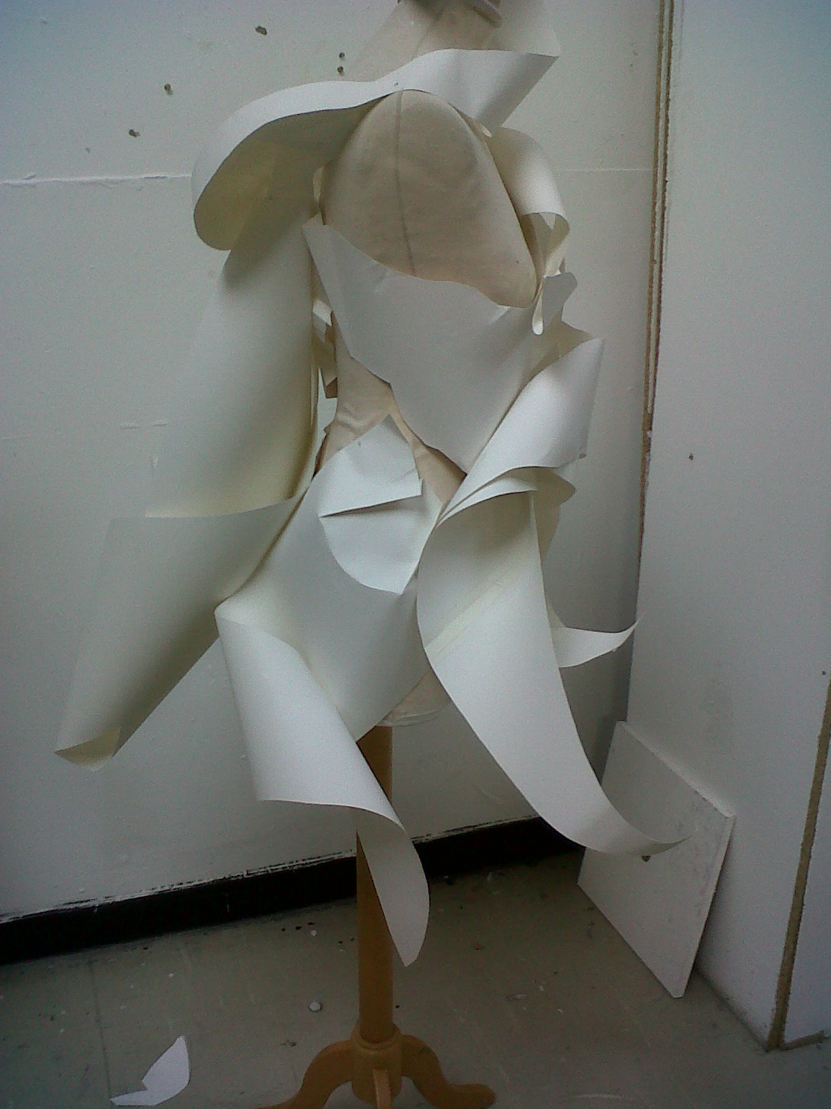

I went on to digitally develop my design by taking elements and positioning them on the figure.

A bit sketchy for an illustration but great for developing my garment.
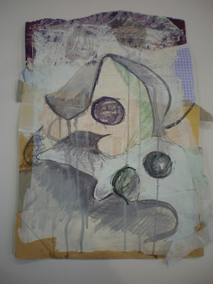
Surface Pattern
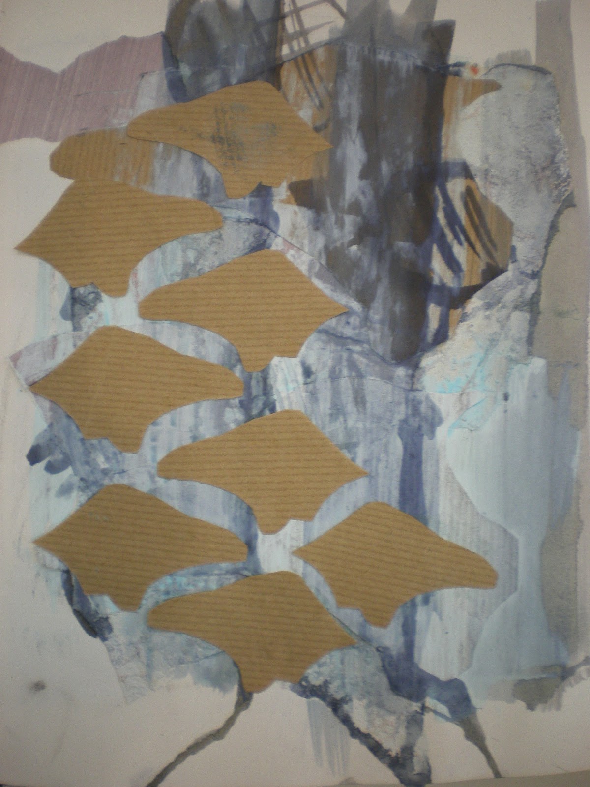
I worked on these observational drawings as a starting point to my pattern.
Using different grounds definitely improved the final image quality. The most effective method of working I found was to work mainly with ink, I accentuated lines with a graphite stick and worked into negative spaces with emulsion and masking tape. I think the limited use of masking tape on the left drawing was effective at improving the outline of the shape.


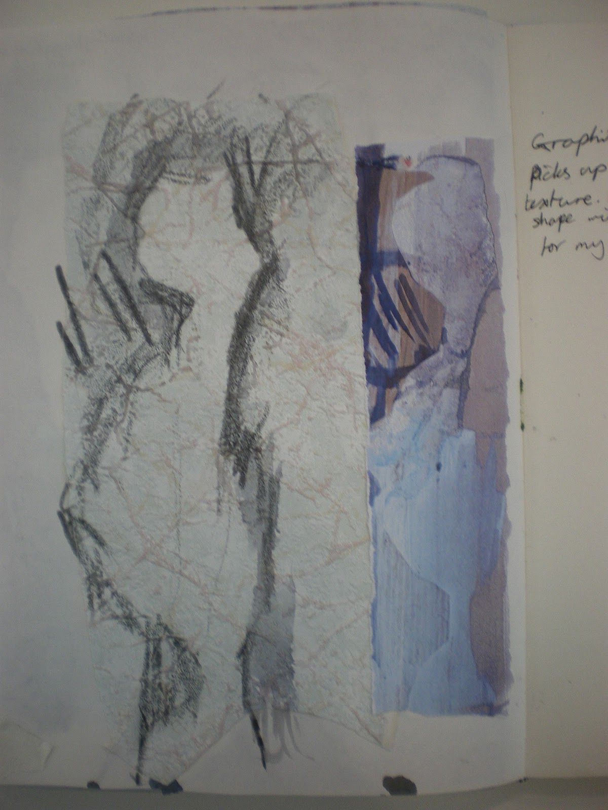
These are the second set of observational drawings I created. This time I put a lot more thought into colour and technique and I believe the outcomes are much stronger. Layering different sized images created attractive negative spaces that I could take into my work.

I took shapes and lines from these drawings and created mono prints which aren't visually to my taste. Although there are patterns and textures that could be incorporated into future work.


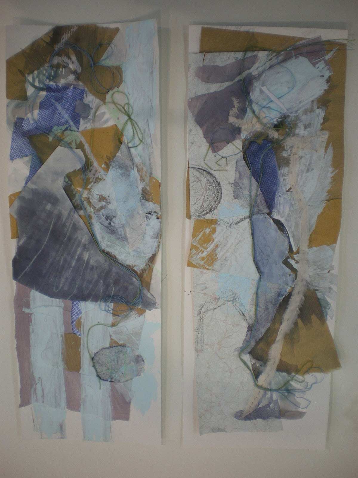
Taking inspiration from my previous studies I created these two final panels. They both share colours and techniques that help them to look cohesive as a pair of panels. the wool stitching running through both designs helps bring them together while the collaged grounds improves the texture.

The final stage was to create fabric samples developed from my panel. So far I have only managed to develop one but I will update with more soon.

Using different grounds definitely improved the final image quality. The most effective method of working I found was to work mainly with ink, I accentuated lines with a graphite stick and worked into negative spaces with emulsion and masking tape. I think the limited use of masking tape on the left drawing was effective at improving the outline of the shape.


These are the second set of observational drawings I created. This time I put a lot more thought into colour and technique and I believe the outcomes are much stronger. Layering different sized images created attractive negative spaces that I could take into my work.


I took shapes and lines from these drawings and created mono prints which aren't visually to my taste. Although there are patterns and textures that could be incorporated into future work.


Taking inspiration from my previous studies I created these two final panels. They both share colours and techniques that help them to look cohesive as a pair of panels. the wool stitching running through both designs helps bring them together while the collaged grounds improves the texture.
The final stage was to create fabric samples developed from my panel. So far I have only managed to develop one but I will update with more soon.

Subscribe to:
Posts (Atom)